What is Distilr

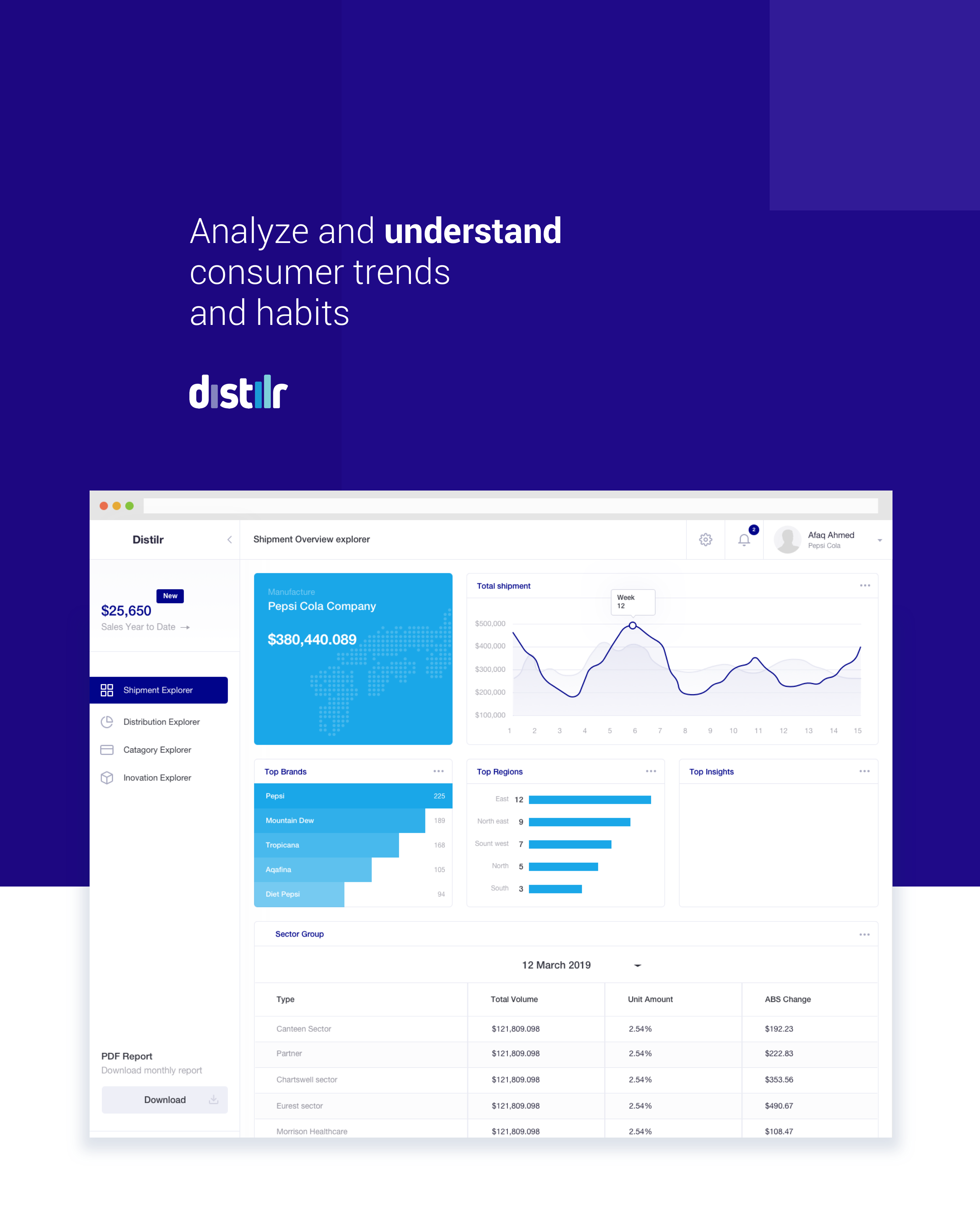
Distilr is a data driven technology based platform to understand and evaluate food industry data and reporting tool- Aimed at identify opportunities for growth across industry type and Compass sectors. The platform enables progress tracking for any promotion product mixes by understanding demographics & purchasing habits, accessible through a web based dashboard for stakeholders and business partners.

Problem

Our Customers usually spend bulk of their time on understanding shipment data from internal sources, But often time they don’t have clear picture of where those shipments are going, who are real customers and often stakeholders don’t have clear picture of their spendings in context of promotions since they are non-trackable through internal shipment data, Some time these brands are unaware of their target audience and demographics.

Approach

I worked in a team with data scientist and product manager to design the end to end experience for the responsive web. I worked closely with the stakeholders in North America to gather user research, gather project requirements, collect feedback and conduct user testing on wireframes, functional prototypes, and visual design. I was also doing a few workshops with internal teams and external stakeholder to ensure the development of the right tool for their need.

Solution

Built a simplified web-based application to be used by stakeholders and Compass sector leads that utilize POS data inputs from compass units and shipment data sources. These input help brands monitoring and evaluating the performance. The end product help stakeholders identify potential target audience and demographics as well as now they can keep track of their promotional results. The product is based on three main layers starting from the executive level of data going deeper to category level and then analytic level.

Exploration

Research
Findings

User research was crucial to the project since we were designing for data and our audience might have multiple variation of analyzing that data. One of the first thing we did was drafting personas in collaboration with our internal stakeholders such as compass group Canada and Foodbuy team. We identify various stakeholders, their needs, motivations and behaviours, and carefully studied their  approach to current data and requirements.  
We Learnt that our stakeholder does not have accurate data and to achieve accuracy in data they need POS data from the compass to understand what sold where and how their business is doing within a particular unit or sector. Our users are already using multiple sources of data, and for that, they have to use various tools which is frustrating for them. Our user needs a one-stop solution to all of their data. It was also cumbersome for users to keep track of promotion and marketing in particular units.
Value Driven Design

upon defining our user need through evaluative interview, we worked with the stakeholder to draft a customer journey map involving all stakeholders and their role with compass data.This help us visualize the scope of the product in a holistic way and provided alignment across various channels. i careful interviews stakeholders to understand their steps taken during any analytic process and their approach to any find any result.
A glance at the life of some of our use
"Wearable devices like Apple Watch and Mi Band can provide various information that valuable for medical usages. Their special advantages like convenience is irreplaceable."
Current Challenges
"The past few years have witnessed the dramatically development in this field, now these two technologies have completely infiltrated in our daily life, even take part in producing activities."
Opportunity Areas
"Advanced communicational technologies enables human to reach faster internet access, introducing the boom of internet industries."

Scalable Architecture
and Flows

Distilr
Dashboard

Final Points

One of the Biggest challenge of working on this product was to organize this massive information in a meaningful format for the stakeholders to review and act upon. I wanted the UI to achieve the following objectives:
1. Present data to stakeholders in a non- intimidating and meaningful way

2. show a progressive process of drill down the data

3. tell a story from overall view to all the way down at skew level
Using machine learning and new technology, we were able to extract insights from available data to help paint a picture of particular unit level data and provide key insights and metrics for actionable items.